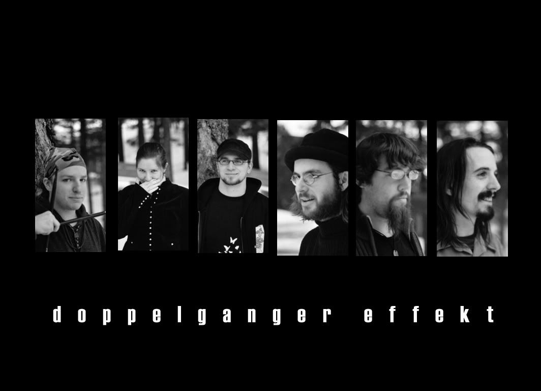
Pretty swell if I do say so myself
Maybe this isn't the most original idea in the world, but I think it looks pretty sharp.

Also I really don't remember photoshop AT ALL. Holy crap. the pictures are al lslightly different sizes because I just eyeballed all of them and they aren't quite the right distance between one another. BUT it's pretty good anyway.
ROCK ON!
p.s. next time I'll try and take everyone's picture from about the same distance.


4 Comments:
This is indeed very cool. Perhaps I should put it for upload in the "Merchandise" section of the site.
But... where's the umlaut?
Yeah about the umlaut. . . i tried putting in soem spots for it and it wasn't working and I'd already spent more time on it than I had scheduled so I gave it a miss. sorry dude. I need to memorize the alt code for a with an umlaut.
p.s. Matt, when you look at this, just use your scroll bars and don't complain about it being big. It's supposed to be a wallpaper.
That's pretty sexy.
Dude, it's not the fact that it's big, it's the fact that the links bar (where your profile picture and all that jazz are) will always be set in place with the config you have, so even if you scroll, the picture is partially obscured by that part of your template.
Unless that's just something that happens on my computer, I dunno.
The photo looks really good though, I like the contrast and the placement on the page. Kudos.
Post a Comment
<< Home